Tuesday, October 27, 2026

Baroque Sacred Art: Hope that Transcends Suffering, #1

The style that developed in 17th-century Italy: its origins, principles, and visual vocabulary

In this posts and a follow-up, I will examine the Baroque tradition of sacred art: where it came from, why it looks the way it does, and what makes it distinctively Christian. The second part will examine how the tradition spread across Europe and the two main tendencies that developed within it. Subsequent posts in this series will look at Baroque secular art, the portraiture, landscape, and still life that emerged as the same habits of perception flowed out from the liturgy into every corner of cultural life.

As regular NLM readers will know well, Pope Benedict XVI, in The Spirit of the Liturgy, identified three authentic traditions of Christian liturgical art: the iconographic, the Gothic, and the Baroque. The iconographic tradition, which dominated Christian art in both East and West until the 12th century, portrays man as he will be in heaven, transfigured, luminous, outside ordinary space and time. The Gothic, which I examined in earlier posts, straddles the divide between heaven and earth, and is best understood, I argue, as the art of the Christian pilgrim, partially transformed by grace yet still journeying. The Baroque is the most naturalistic of the three. It portrays fallen, historical man, in this life, in the full drama of suffering and grace. That drama, and the Christian hope that transcends it, is what Baroque sacred art is fundamentally about.

The Baroque is also the most influential of the three traditions on art more broadly. As the naturalism of late Gothic painting increased, artists began applying the same visual principles to secular subjects, but the Baroque fully established this tendency, creating a tradition in which the habits of observation and perception formed by creating art for the altar extended naturally into wider contemporary culture. A painter skilled in depicting the light of Christ on the face of a saint would bring the same level of skill and insight to a landscape, a portrait, or a still life, not as an overtly religious act, but in the recognition that the beauty of Creation speaks of its Creator.
Saint Francis of Assisi in Ecstasy (c. 1595), by Caravaggio, one of the pioneers of the Baroque.
The Council of Trent and the Origins of the Style
The Baroque style in art emerged in the late 16th and 17th centuries as a powerful artistic response to the Catholic Church’s Counter-Reformation efforts, particularly the Council of Trent’s directives on sacred images issued at its closing session in 1563. Building on the precedent set by the Seventh Ecumenical Council, which closed in 787 and which defended the veneration of religious images, Trent reaffirmed the importance of art as a vehicle for faith while addressing Protestant criticisms. Concerned that some religious imagery had grown overly complex, indecorous, or inaccessible to ordinary believers, the Council instructed artists to portray the mysteries of the Faith, the lives of saints, and the truths of redemption with clarity, emotional directness, and devotional effectiveness, avoiding lasciviousness (that is, the promotion of disordered sexual desire), doctrinal error, superstition, and anything that might confuse or mislead the uneducated, thereby fostering a more immediate and edifying visual language that helped define the Baroque aesthetic.

It took time for the artistic community to absorb and successfully manifest these general directives. By the end of the century, approximately thirty years later, a coherent tradition was emerging that built upon the finest stylistic achievements of the 16th century.

The origin of the name ‘Baroque’ is not known with certainty. Commentators speculate that it is a pejorative term derived from the Portuguese word for an imperfect pearl, barocco, which art historians later applied to the more extravagant examples of the style. I offer another suggestion below by connecting it to the work of one of the tradition’s pioneers, the Italian artist Federico Barocci.

While the primary impetus for this new style was the desire to create a form of sacred art, it very quickly became the standard for all secular art as part of the broader Catholic cultural response to the Reformation. On seeing the beauty of this style, even Protestants decided they wanted to paint in this Catholic manner, and they copied and adapted it to their own needs, developing parallel theological justifications for its use, as happened notably in Holland. The Protestant Dutch artists of the period, among them Rembrandt, painted portraiture, landscape, and still life in this new style.

The power of Baroque beauty was noticed in Protestant England too. Anthony Van Dyck, a Flemish Catholic and student of Rubens, was invited by the Protestant Charles I of England to serve as his court portrait painter and was elevated to the title of Sir Anthony. He was so successful and influential that the English school of portraiture was inspired by him and sustained itself for 250 years after his death. Figures such as Gainsborough and Reynolds were the most celebrated painters of this school. Americans will be familiar with the portraits of the founding fathers, particularly of George Washington by the American artist Gilbert Stuart, which were executed in the style of the English portrait school.

The Origins of the Baroque Style: Federico Barocci
The Italian artist Caravaggio is credited with popularizing the style at the end of the 16th century, but perhaps the clearest early articulation of what became the Baroque came slightly earlier, from another Italian, Federico Barocci. Consider this painting of St Jerome, which he completed in 1598.
Federico Barocci, St Jerome, 1598
I have never read a historical account that confirms this, but I have long wondered whether the term ‘Baroque’ is, in part, a play on his name. Barocci’s work from this period certainly bears all the hallmarks of the tradition he was pioneering.

Several features immediately direct the eye to the figure of St Jerome. He is painted with the most naturalistic coloration, is the most brightly lit, and is the most precisely rendered and sharply focused element of the composition. Barocci reinforces this by setting the figure against a background of deliberately restricted tonal range: a single color, sepia, varied only in its tonal values and given almost no detail. The brightest colors in the composition are concentrated in the cloth immediately surrounding the saint. The sharpest tonal contrast runs along the edge of his right elbow, tracing upward along his shoulder to a sharp point just below the right ear, leading the eye steadily toward the face. This contrast is further intensified by darkening the background immediately adjacent to that edge.

The sharpness and clarity of rendering also vary across the painting. The least precisely handled areas are on the periphery; the most detailed are the saint’s face and hands, the two elements through which expression and gesture communicate the person’s interior life. Through these, the artist portrays the man as a living being with a soul.

Compare Barocci’s painting with this work on the same subject, done nearly fifty years later, in 1646, by the Spanish artist José de Ribera, who spent most of his professional life in Italy.
We can see the same stylistic features at work, except that St Jerome’s face is no longer the primary focus. Ribera directs us instead toward the Word, as exemplified by the scroll. St Jerome produced the Latin Vulgate translation of the Bible, and Ribera draws our attention to it, perhaps underscoring that Catholics hold Scripture in the highest regard and directly countering Protestant accusations to the contrary.

The sharp contrast between light and dark throughout Baroque painting symbolizes both the darkness of evil and suffering in this fallen world and the Light that overcomes it. This visual device embodies Christian hope, which transcends suffering.

Within a few decades, this style of idealized naturalism had become the standard model for new sacred art across Catholic Europe. As with any living tradition, artists retained room for personal variation within its boundaries; some, for instance, incorporated lighter ochres or cool grays alongside sepia in their tonal work. Broadly speaking, however, the style remained remarkably consistent throughout the 17th century, before gradually and subtly declining in the 18th as the rising influences of Neoclassicism and Romanticism began to transform artistic priorities.

Why This Style Works
The stylistic vocabulary of the Baroque, its variation of tone, color, and focus, is not an arbitrary invention. It accounts for how we actually look at the world and process visual information in the mind. The image cast onto our retinas is not evenly colored or uniformly focused. It is sharply focused and richly colored at the center, where the cone cells respond to color; it is blurred and effectively monochrome at the periphery, where the rod cells respond only to tonal information. We are not ordinarily aware of seeing in this way, because the eye moves constantly across the scene before it, collecting information. The picture we are actually conscious of is an aggregate of this information, assembled from memory. As we observe the world, we tend to notice sharp tonal contrast and strong color first, and we spend the most time examining these and other points of greatest interest to gather more visual information.

A painting is a snapshot in time, but the mind naturally supplements it with information from memory, drawing on recollections of similar scenes encountered in the past. What we see in our mind’s eye at any moment when engaging with a Baroque painting is therefore more natural to us than what we would experience when looking at an image in which every detail, from border to center, is rendered with equal precision, as in photorealism or some 19th-century naturalism.

The effect on the viewer is to direct the imagination toward God by employing a dynamic similar to what we experience when we respond to Creation with awe and wonder. God made us to look at the world in a particular way so that we might see the Creator in his Creation and delight in both. By delivering visual information in a way that stimulates the same dynamic process of observation, the artist who paints well makes his painting speak of Christ as powerfully through its beauty and style, regardless of the content, just as the cosmos itself does.

Next week, in Part 2, I turn to how the Baroque tradition spread organically across Europe and examine the two great tendencies that developed within it: Baroque Classicism, which sought a more idealized, classical look, and Baroque Naturalism, which insisted on direct observation from life. I will also look at a question that matters practically for any artist working in sacred art today: how does sacred art differ from portraiture, and why does the distinction matter?

Tuesday, October 13, 2026

On Gothic Art, Part 2

Late Gothic masters, the threshold of the Renaissance, and the birth of secular art

Last week I introduced the Gothic tradition: its historical origins in the cultural shifts of the 12th century, its theological character as the art of those on pilgrimage between the fallen world and heaven, and its visual characteristics as illustrated in works by Duccio, Lorenzetti, and Matthew Paris. This week I turn to the later Gothic masters, the point at which the style begins its transition into something new, and the new art forms that the Gothic spirit made possible.

Late Gothic: Van der Weyden 
The Descent from the Cross by Flemish artist Rogier van der Weyden, 1435, is a late Gothic work in which the degree of naturalism is substantially higher.
Because the Italian Renaissance was already underway at this time, albeit in its early stages, some classify this style as ‘Northern Renaissance.’ To my eye, however, this remains an essentially Gothic painting. The figures still occupy the middle distance, giving us a sense of emotional distance between the observer and the scene and positioning us as detached witnesses. That quality of detachment, inherited from the iconographic tradition, is the mark of Gothic art even at its most naturalistic.

Fra Angelico
Annunciation, Cell 3, Convent of San Marco, Florence, c. 1440-45

Fra Angelico was a Dominican friar from Fiesole, near Florence. He was aware of the changes in art occurring around him, but retained much of the Gothic spirit of his northern contemporaries, such as Van Eyck and Van der Weyden. He was willing to incorporate the new device of single-point perspective into his work, but used it sparingly and selectively, depending on the subject matter. I would still place him at the more naturalistic end of the Gothic spectrum rather than as a Renaissance artist, because his figures show no strong influence of classical Greek sculpture. For me, this is still the art of pilgrimage, of the baptized on their journey to heaven.

The Threshold of the Renaissance: Ghirlandaio

A Madonna and Child from around 1470-75 by Domenico Ghirlandaio illustrates precisely where Gothic art ends and something new begins.

Ghirlandaio has placed his figures within a flat architectural surrounding, as an iconographer or Gothic artist might, but the figures themselves are in a very different style. Their roundedness of form, so unlike Fra Angelico or Van der Weyden, is derived from his study of classical Greek and Roman sculpture. Suddenly, this is more connected and anticipates the styles of Leonardo, Michelangelo, and Raphael, who followed him, than to the Gothic artists who preceded him. The figures seem ill at ease in the flat background he has given them. The medium, egg tempera, gives the image a natural flatness suited to iconography, but it sits at odds with the strongly three-dimensional character of the figures. This inherent tension between the flatness of the medium and the three-dimensional ambitions of the figures is precisely why it is so appropriate that artists of the period moved from egg tempera to oil, and began to place figures in settings that enhanced the illusion of depth. Leonardo, whose manner of representing the figure was not dissimilar to Ghirlandaio’s, used not egg tempera but multiple oil glazes that created a sense of plunging depth and space around the figure.

The Development of Sculpture
Sculpture is not forbidden in Eastern and Byzantine Rite churches, but it is rarely seen. This is because the iconographic style is essentially two-dimensional. The iconographer is deliberately seeking to eliminate as far as possible any strong sense of three-dimensional form or depth. Where carvings do appear, they are generally relief sculptures in which the artist cuts into the surface to create a shadow pattern, the form described by the contrast between lit portions and dark shadows. The result remains far closer to a flat image than to fully three-dimensional sculpture.
Anonymous artist, Byzantine Empire, pre-1453. Relief carving of the Nativity in the iconographic style
Because the Gothic style allows for greater depth and more rounded forms than the iconographic style, it was natural that sculptors began to push outward from the surface. What began as deeper relief carving gradually became, over time, figures that stand free in three-dimensional space. The sculptures shown below, from Reims Cathedral in France, date from the 13th century. They are fully three-dimensional but still attached to the architectural surface; they have not yet escaped entirely to become figures one can walk around, as one might with a 15th-century sculpture. They depict the Annunciation on the left and the Visitation on the right.
The New Secular Art: Portraits and Landscapes
The greater interest in the natural world and the desire to see God reflected in the ordinary things of Creation also led to the development of portraiture and, to a lesser extent, landscape as distinct art forms. Some of what drove this was undoubtedly the vanity of those who now had the means to commission art, but there is also a holy and legitimate interest in the human person as a unique creation of God. This portrait of a man in a turban by Jan van Eyck (believed by some to be a self-portrait) was painted in 1433.
Stylistically, this portrait draws on the same visual language as the sacred art of the time, demonstrating a principle that runs throughout my writing: great art movements begin on the altar. The traditions formed in the service of the liturgy do not stay there; they flow outward into every aspect of the culture.

There is a way of understanding this that goes beyond the merely stylistic. In an earlier post, I described the mandorla, the almond-shaped halo of light that surrounds Christ in icons of the Transfiguration. Its concentric rings represent, for me, the light of Christ reflected outward into the cosmos and human culture. A well-painted landscape, a sensitively observed portrait, a beautifully designed domestic object: all of these, when they participate in the tradition of beauty formed by the liturgy, become outer rings of that mandorla, reflecting something of the light of Christ into every corner of ordinary life. That is what Gothic art, at its best, achieved; and it is why the secular art that grew from it, for all that its subjects were not religious, remained in a deep sense sacred in spirit.

Sunday, October 11, 2026

The Feast of the Holy Fathers of the Seventh Ecumenical Council

In the Byzantine tradition, today is the commemoration of the Holy Fathers of the Seventh Ecumenical Council, the second held in the city of Nicaea, at which the Iconoclast heresy was condemned, and the sacred images restored to their rightful places for the veneration of the Christian faithful. The definitive decree on the veneration of images was promulgated at the seventh session of Second Nicaea, on October 13, 787; the commemoration is fixed according to various traditions to a Sunday close to that date. Some years ago, I heard a sermon at a Byzantine liturgy on this day which recalled an important truth about this council, namely, that it did not decree that sacred images are merely good and useful, but that they are necessary!

The rejection of the sacred images, particularly those of Christ, is ultimately a denial of the Incarnation. The very choice of location for the council expressed this idea; at the time it was called, the two previous ecumenical councils and the important synod ‘in Trullo’ had all been held in Constantinople. The Empress Irene, who as regent of her young son Constantine VI, arranged for a council to condemn iconoclasm, had tried to hold it in the imperial capital, but it was broken up by soldiers friendly to the heresy. It was therefore moved to Nicaea, where the first ecumenical council had gathered 462 years earlier to condemn the Arian heresy that denied the true divinity of Christ. (To put this in chronological perspective, this is a greater distance in time than that between Trent and Vatican II.)

The refusal to depict Christ is a rejection of the fullness of His humanity, which is real, solid, and “circumscribed”, i.e., subject to limitations, and therefore capable of being expressed in an image. His humanity is the means of our redemption and salvation, as we confess in the Creed every Sunday, “For us men and for our salvation He came down from Heaven, etc.” In the eighth and final session, the Council therefore also anathematized all who do not confess that “Christ our God is circumscribed according to His humanity.” The Greek word used here, “perigrapton – circumscribed”, is related to the verb “graphein – to write”, the term which is often used in Greek to refer to the painting of icons. None of this is accidental.
The famous icon of Christ the Pantocrator from the Monastery of St. Catherine on Mt Sinai, 6th century. The collection of icon at St. Catherine’s is particularly important, since it contains a large number of pieces that predate the iconoclast persecutions.
The liturgical texts proper to this commemoration make the point in a very interesting way. At Second Nicaea, the Patriarchs of Constantinople who had supported the iconoclast heresy were all condemned by name. However, they are not referred to in the liturgy, nor are the iconoclast emperors Leo the Isaurian, the real inventor and motivator of the heresy, and his two successors, Constantine V and Leo IV. (The traditional nickname of the second of these, “Copronymus”, means “dung-named” in Greek, a reference to what would now be called a diaper accident that occurred at his baptism; this was taken by those who honored the sacred images as a presage of his impiety. It occurs repeatedly in the Roman Martyrology, in reference to the many Saints killed or otherwise persecuted by him for the sake of the sacred images.)

It would be easy, but unjust, to see in this omission nothing more than an unwillingness to offend the offices of the Emperor and Patriarch. The greater truth taught by the Council, and by the Byzantine liturgy, is that the refusal of sacred images is a refusal of the Incarnation. To this point, therefore, the earlier Christological heretics are named repeatedly in the liturgy of the day, as in these texts from Vespers (bold texts are my emphases).
As true shepherds you bravely drove away those who are like Macedonius, Nestorius, Eutyches, Dioscorus, Apollinaris, Sabellius and Severus (of Antioch), exposed as dangerous wolves in sheepskins, far from the Savior’s flock, stripped of their fleeces, making them thrice-wretched; therefore we call you blessed.

Let us praise today the mystical trumpets of the Spirit, the God-bearing Fathers, who sang a harmonious melody of theology in the midst of the Church, to the one Trinity, unchanging Essence and Godhead; the overthrowers of Arius, the champions of the Orthodox, who intercede with the Lord that He may have mercy on our souls.

Holy Fathers, you have become sure guardians of the Apostolic traditions; for by teaching the orthodox doctrine of the consubstantiality of the Holy Trinity, you overthrew in council the blasphemy of Arius. With him you refuted Macedonius, the opponent of the Spirit, and condemned Nestorius, Eutyches and Dioscorus, Sabellius and Severus the Leaderless. We implore you: beg that we who have been delivered from their error may preserve our life spotless in the faith.
The following text, sung between the first and second parts of the doxology at the Aposticha, is particularly noteworthy. One might easily assume it was a part of the commemoration of the Fathers of the First Ecumenical Council on the Sunday after the Ascension, rather than that of today, again underlining the intrinsic connection between iconoclasm and Arianism, and between veneration of the images and the Incarnation. (A friend of mine who is a great scholar of the Byzantine liturgy tells me that this hymn may very well have been composed for the commemoration of the Fathers of First Nicaea, and later added to this feast.)
Let us with faith celebrate today the yearly commemoration of the God-bearing Fathers, who were assembled from the whole world in the radiant city of Nicaea, as we reverence the gatherings of the orthodox; for they, their minds attuned to true religion, overthrew the godless teaching of Arius, and in council banished him from the Catholic Church; and in the symbol of faith, which they precisely and devoutly laid down, they taught all to confess clearly the Son of God as consubstantial and co-eternal, and existing before the ages. And so we too, following their divine teachings and firm in our belief, worship the Son and the all-holy Spirit with the Father, in one Godhead, a consubstantial Trinity.
A 19th-century icon of the Fathers of the First Seven Ecumenical Councils. The Byzantine liturgy contains several such commemorations: of the fathers at First Nicaea, at Ephesus, at Second Nicaea, at the Seven Councils collectively.
Although Iconoclasm was definitively condemned at Second Nicaea, it was revived in the early 9th century for almost thirty years under the emperors Leo V (813-20), Michael II (820-29) and Theophilus (829-42). Shortly after Theophilus’ son Michael III, (the bearer of another unfortunate nickname, “the Drunkard”), came to the throne as a child of two, his mother and regent Theodora arranged for the definitive restoration of the icons at a synod in Constantinople. (Theodora is venerated as a saint in the Byzantine Rite.)

St. Theodora, Empress of Byzantium, in a 19th-century Greek icon.
The liturgical expression of this final victory is the celebration of the first Sunday of Lent as the “Feast of Orthodoxy.” On that day, the Byzantine liturgy reads a text known as the “Synodikon of Orthodoxy”, a collection of the anathemas of the first seven ecumenical councils. The text has been much altered and added to over the years, but the first rubric in one of the oldest manuscripts describes it thus: “A yearly thanksgiving is due to God on account of that day when we recovered the Church of God, with the demonstration of the dogmas of true religion and the overthrowing of the blasphemies of wickedness.”

The final eight anathemas are dedicated to the iconoclasts, (and the iconoclast patriarchs are named explicitly.) The first one says,
On those who accept with their reason the incarnate economy of God the Word, but will not allow that this can be beheld through images, and therefore affect to receive our salvation in words, but deny it in reality: Anathema!
And the second:
On those who wickedly make play with the word ‘uncircumscribed’ and therefore refuse to depict in images Christ, our true God, who likewise shared our flesh and blood, and therefore show themselves to be fantasiasts: Anathema!

Tuesday, October 06, 2026

On Gothic Art, Part 1

The art of pilgrimage

In this and another post next week, I want to look at the Gothic style of Christian art: where it came from, what makes it theologically and artistically distinctive, and how to recognize it in practice through a series of examples. Part 2, next week, turns to the later Gothic masters, the point at which the style begins its transition toward the Renaissance, and the development of secular art that the Gothic spirit made possible.

An example of the late Gothic style, the “Pietà of Villeneuve-lès-Avignon” by Enguerrand Quarton, mid 15th century.

As many NLM readers will already know, Pope Benedict XVI, in The Spirit of the Liturgy, identified three authentic traditions of Christian liturgical art: the iconographic, the Gothic, and the Baroque. Each is a legitimate expression of the Christian understanding of the human person and our relationship to God, and each communicates that understanding through a distinct visual language, thereby promoting prayer and worship among the faithful. The iconographic tradition, which dominated Christian art in both East and West until the 12th century, portrays man as he will be in heaven: transfigured, luminous, outside ordinary space and time. The Baroque, which developed in the 17th century, portrays fallen historical man in this life, in the full drama of suffering and grace. The Gothic stands between them, and it is the art most characteristic of the high medieval period in the West.

What Is the Gothic?
The Gothic is an authentic and distinct style of liturgical art that developed organically in the West from the iconographic prototype. As the change was gradual, any attempt to date its beginning involves some arbitrary choice. Most commentators settle on the mid-12th century, coinciding broadly with the completion of what is generally considered the first Gothic church, the Abbey of St Denis in Paris, in 1144. The name ‘Gothic’ was coined by High Renaissance commentators as a term of contempt. They held it to be a barbaric style belonging to the period of cultural decline that they believed had begun when the Goths overran the Roman Empire in the West a thousand years earlier. Historians today do not generally share that view of cultural decline, but the name stuck. Even those of us who admire Gothic culture and art continue to use it!

The impetus for the departure from the iconographic prototype stemmed from an increased emphasis on the reliability of human experience and the value of information received through the senses. This led to a greater curiosity about and appreciation of the natural world. Such appreciation was not new: Christians had always relied on sensory information and valued the beauty of the cosmos. What was different was the degree of weight now placed upon them.

Tied to this was the conviction that our world, though fallen and imperfect, is nevertheless good, ordered, and beautiful. There may be evil and suffering in the world, and it may not be as good and beautiful as it ought to be, but it remains God’s creation. This appreciation of the natural world and confidence in our ability to know it through the senses sparked curiosity and a desire to observe it more closely. One effect was the rise of scientific inquiry; another, the one that concerns us here, was an increased naturalism in art, a greater correspondence to natural appearances. The devotion to rational inquiry bound up with this cultural movement also led to a new approach to learning, and to the establishment of the great universities, among them those of Paris and Oxford.

Several factors combined to produce this cultural shift. Around 1000 AD, the Latin West increased its contact with the Greek East and the Islamic world through trade and warfare, including the Crusades and the Reconquista, the reconquest of Spain from the Moors. This gave Western Europe, for the first time since the decline of the Roman Empire in the West, access to many lost works of classical writers, particularly in the form of Arabic transcriptions of Aristotle. Over the following century, Christian, Jewish, and Muslim scholars collaborated to translate and interpret these texts. It was the friars, the new mendicant orders, the Franciscans and Dominicans, who achieved much of the synthesis of the new learning with the tradition inherited from St Augustine and the Church Fathers. The most significant of these figures is the Dominican St Thomas Aquinas.

This age was characterized by the creation of new ideas and a drive to popularize them. The preaching of the Dominicans and the broad appeal of St Francis of Assisi’s spirituality, which included a love of the beauty of the natural world, led in particular to a wider appreciation of the natural world as part of God’s creation. This shifting worldview, while still firmly Christian, gave rise to cultural movements driven as much by holiness and great artists as by great thinkers.

The New Naturalism
The greater emphasis on direct observation led to an enhanced naturalism fused to an iconographic substrate. What began in the Romanesque period, up to the mid-12th century, as a more naturalistic variant of the iconographic style eventually became so naturalistic that it broke the limits of what had constituted an icon, for example through the introduction of cast shadows and the depiction of figures in profile. Nevertheless, Gothic art always owes something stylistically to the iconographic. It retains, for example, the emotional distance maintained in the portrayal of figures, so that the observer always feels slightly detached from the scene depicted. Even in late Gothic styles, such as those of the Flemish artists Van Eyck and Hieronymus Bosch, we can see how much they owe to the iconographic tradition.

If one were to characterize this style theologically, it is too naturalistic to be considered a portrayal of man as he will be in heaven, which is what the iconographic style portrays, and not naturalistic enough to be a portrayal of fallen humanity as we experience it in this life, which is the subject of the Baroque. It straddles the divide between the two, much like the Christian life within the Church.

When a man is baptized, confirmed, and living the sacramental life, he is transfigured partially by grace even in this life. We may not see it ourselves, but that transformation is real. We are, to use St Peter’s phrase, ‘partakers of the divine nature.’ But we are only setting out on the journey, and we can suffer setbacks and reversals as well as progress. This transformation is only complete and permanent when we are in full union with God in heaven, but while we are on this pilgrimage to heaven, as part of the mystical body of Christ, practicing Catholics are in this respect Gothic men and women.

It is worth noting that the Gothic age is characterized historically as an age of pilgrimages. Many of the great cathedrals were pilgrimage destinations, and it is fitting to describe Gothic art as the art of pilgrimage for that reason also.

If we wanted a single symbol of this age, it might be the spire of the great Gothic cathedral. The Gothic cathedrals of France and England, perhaps more than any other aspect of the culture, characterize this period. The new learning led not only to a new approach to design, developing gradually from the Romanesque styles that preceded it, but also to advances in structural engineering that enabled the creation of higher, more complex structures with larger windows. These stained-glass windows became works of art manifesting the same stylistic elements as the paintings, but now in the medium of colored glass. The Gothic spire that so often sat atop the magnificent new churches and cathedrals born of an outpouring of faith symbolizes this age of pilgrimage in that, more than any other architectural feature, it seems to span the divide between heaven and earth.

Early Gothic: Duccio’s Transfiguration
We can now look at some examples to illustrate the style’s general characteristics. Consider this painting of the Transfiguration by Duccio di Buoninsegna, ca. 1308-11.

This painting has many characteristics of iconographic art. Christ, the most important figure, is the largest; the mountain, which in nature would dwarf any of those present, is significantly smaller. Through these differing relative sizes, the hierarchy of being is communicated: Christ is the highest, and inanimate mountains the lowest. There is no scenery beyond what is necessary to the narrative; anything superfluous to the spiritual message is omitted. All the figures have halos, and Christ has gold-leaf lines on his garment, indicating that even his clothes shine with the heavenly, uncreated light. All of this is strongly iconographic.

However, here is the departure: the figure of John in the center is shown in profile. Duccio has done this to visually connect John with Christ. He wants to show John looking at Christ; given that John is closer to us than Jesus, to look at him John would have to turn away, and we would see only the back of his head. Duccio does not want that, so he uses the pictorial device of portraying John looking directly upward, as though Christ were physically above him and both were in the plane of the painting, which forces him into profile. A conventional iconographic portrayal of the Transfiguration would show the central figure, John, looking towards us, and away from Christ in shock, to avoid depicting him in profile.

Lorenzetti’s Deposition
The Deposition from the Cross by Pietro Lorenzetti, an artist from Siena, was painted in 1320 in the basilica of St Francis of Assisi, and is a good illustration of the distinction between the iconographic and Gothic.
As with Duccio’s Transfiguration, this painting has many figures in profile. This allows Lorenzetti to place them in close proximity to one another, so that each can participate in a beautiful, rhythmical, and flowing design as a harmonious expression of love. While intimacy between two figures can be conveyed in the iconographic style (the Mother of God and Christ are often portrayed cheek to cheek), it is very difficult to show so many figures connected in such an intimate way, each acknowledging the others’ presence, without showing them in profile. This enhanced emotional register is characteristic of Gothic painting generally. The emotion of the figures should be distinguished from the modern concept of ‘self-expression’ or from the artist’s passion. Lorenzetti’s goal is not to tell us what he feels; it is to portray what the figures depicted felt.

Matthew Paris and the English School
Matthew Paris was an English monk who lived at St Albans, in southern England, in the 13th century. We have many examples of his pen-and-ink sketches, which include direct observations of the natural world around him. He also illuminated psalters, including the Westminster Psalter. The image below is taken from a manuscript, the Life of St Alban, depicting Heraclitus taking down St Alban’s head.
His style is characteristic of English art of the period, in which form is described by line almost to the exclusion of tonal description. He controls the quill pen with great assurance, creating smooth, rhythmically flowing lines and varying its darkness and width to draw the viewer’s eye to the most important parts of the composition. The coloration and shading are restrained, which gives his images a symbolic quality appropriate to sacred art. Many wall paintings of this period can still be found in English churches, including St Albans Cathedral itself, that follow this basic structure. Because it is reminiscent of modern illustration and animation art, familiar to and popular with so many people today, this is a form that 21st-century artists could take to easily. It is powerful yet accessible. I teach classes in this style, which I call the School of St Albans, myself.

Next week, in Part 2, I turn to the later Gothic masters: Van der Weyden and Fra Angelico, and the point at which the style begins its transition to the High Renaissance as seen in Ghirlandaio. I also look at how the Gothic’s new appreciation of the natural world gave rise, for the first time, to sculpture as a fully three-dimensional art form, and to portraiture and landscape as distinct genres in their own right.

Tuesday, September 22, 2026

The Iconographic Style, #2: Images Not Made with Human Hands

Does an icon truly resemble our heavenly destiny, or only symbolize it — and what does Our Lady of Guadalupe tell us about the answer?

This is the second of two related articles on the iconographic tradition. In the first, I set out the history of the style, the modern myths surrounding it, and the theology that accounts for its visual language. Here I turn to a question that the tradition raises but cannot settle from within: does an icon actually resemble our heavenly destiny, or is it only a consistent system of symbols? The strongest evidence, I will argue, comes from the images said to be “not made by human hands”, and above all from that of Our Lady of Guadalupe.

As I described the various elements of the visual vocabulary of icons in the previous article, a question naturally arises: does what we see in these images correspond to what Christ and the saints actually appear to be in heaven? Or might it be an internally consistent system of visual symbolism that successfully communicates an idea of the eschaton without actually resembling our heavenly destiny? We cannot know that for certain until we arrive there.

However, the strongest argument for a genuine visual correspondence comes from the existence of icons “not made by human hands.” In the East, we have the Mandylion, whose legendary origin involves a cloth that received the image of Christ’s face through direct contact with him during his public ministry. In the West, the Veronica cloth serves as its parallel: a separate tradition holds that Saint Veronica offered her veil to wipe the sweat and blood from Jesus’ face as he carried the cross, miraculously imprinting his features upon it. Both relics are said to be acheiropoieta (images not made by human hands), and although their originals are now lost, numerous later icons and copies based on these prototypes survive. What is striking is how closely each corresponds to the same iconographic type. The name Veronica, incidentally, derives from the Latin vera icon, meaning “true image.”
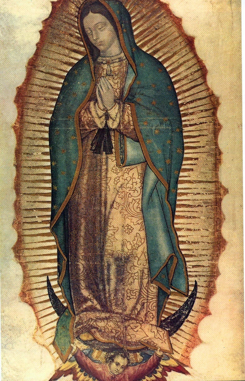
Among these revealed images is another Western example: the famous Our Lady of Guadalupe. It contains details clearly derived from Aztec culture, others from traditional Christian culture, and some not normally associated with the Spanish Christian culture of the time. What is remarkable is how these disparate elements are combined to form a unified image that has retained its power of appeal across centuries. The image, given to St Juan Diego, a poor Aztec man in 16th-century Mexico, caused millions to convert. It persuaded both the Aztecs and the occupying Spaniards, and continues to draw devotion from Christians around the world.
The elements related to Aztec culture are as follows. Our Lady’s hairstyle, with the central parting, was the sign of a maiden and a virgin. The ribbon and bow around her waist signified pregnancy. The quatrefoil roses articulated in sepia lines on the pale brown-ochre shawl signified royalty. Aztecs looking at this image would have recognized the meaning of these features immediately.

But the image spoke to the Aztecs about more than their own culture, because it also contained elements drawn from traditional Christian iconography, elements that are universal, speaking to all people of Christ. These were noticed by the 16th-century Spaniards and have connected with Christians from all over the world ever since.

The blue shawl, for example, is a common color for Mary’s outer robe, said to denote royalty; Marian chapels have traditionally had their walls painted blue. The eight-pointed stars represent her connection with the ‘eighth day’ of Creation, her Son, Jesus Christ, who rose on the eighth day of the week. Stars are not the only heavenly bodies represented; the moon appears as well, in accordance with the description of the woman of the Apocalypse, who stands upon an upturned crescent moon.

Another feature of particular interest is the nimbus of light surrounding her whole person. The account of the woman in the Book of Revelation describes her as ‘clothed in the sun,’ and the golden nimbus might correspond to this. But I would suggest that its presence here indicates more specifically Christ’s presence within her womb: it is there not so much for the God-bearer as for God himself, whom she bears. This is the visual means of indicating that Our Lady is with child, the divine child, and it complements the Aztec symbolism of pregnancy, the bow and ribbon. Had this image not also spoken to the Spanish occupiers, no one would have taken St Juan Diego seriously.

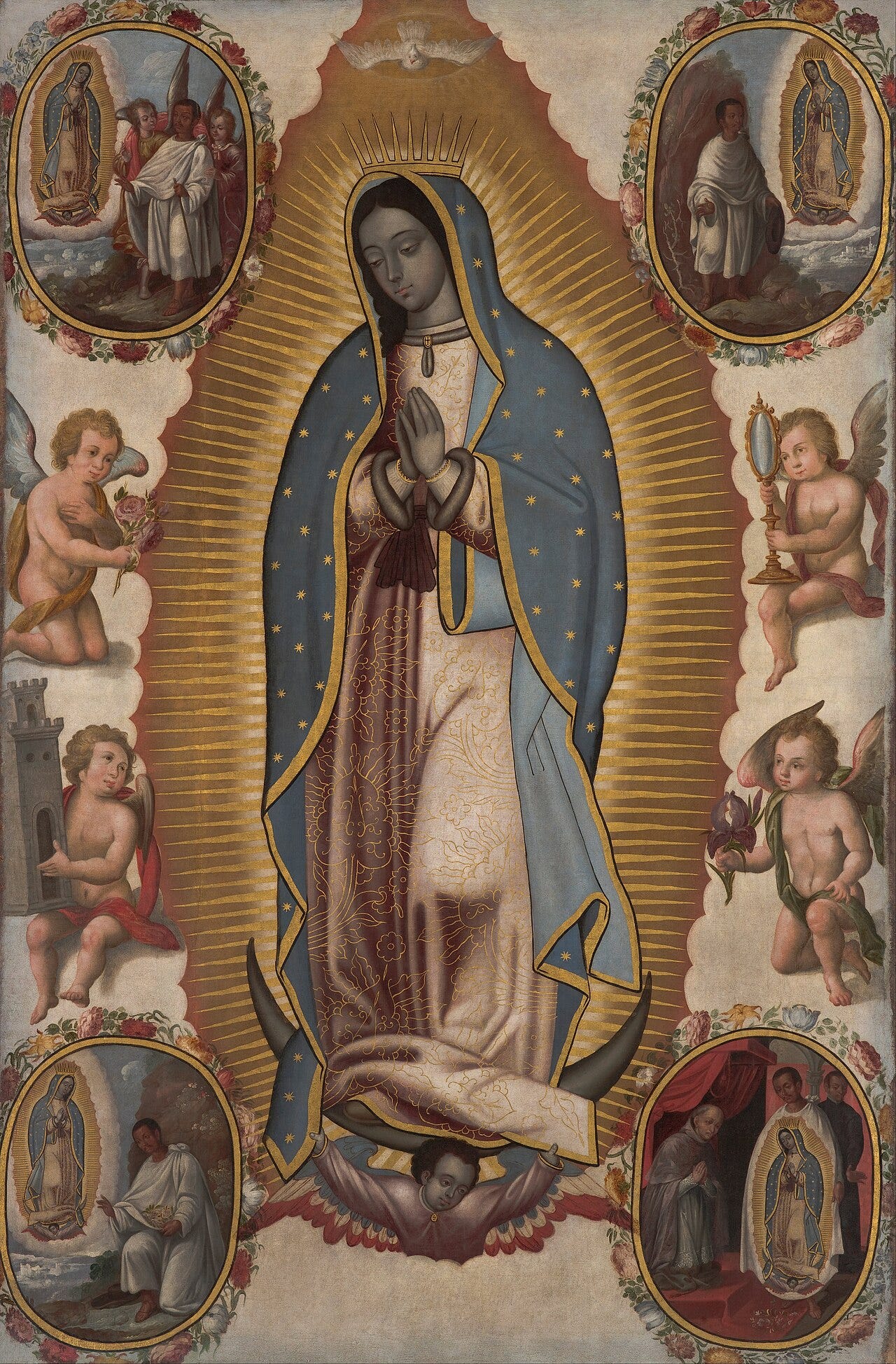
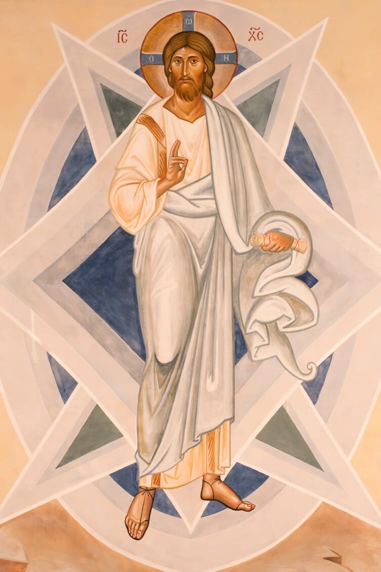
Look closely at the gold field that surrounds her. This is not, as one might first suppose, a series of bright gold rays emanating from Our Lady. Rather, it is a series of dark rays on a gold background, the outer limits describing the mandorla shape, a smooth almond. This mandorla darkens as we move toward its center, exactly as the mandorla around Christ in the Transfiguration icon does. It is worth noting that some later copies of this icon get this detail wrong, inverting the shading direction. Here, for comparison, is one painted around 1700; note the inversion of the shading of the mandorla, compared with the original.
The Transfigured Christ, fresco by Aidan Hart, Lancaster, England, 21st century
Christ transfigured
All the constituent elements of the image – including aspects not described here, particular to time and place as well as universal in their appeal – are combined to create a composition of remarkable persuasive power. Their presence together creates a paradox: if the artist is not divine, then we have indeed a mortal artist of extraordinary gifts, one simultaneously conversant with Aztec culture, Scripture, and the traditional Christian iconographic tradition that was not then fashionable in 16th-century Spain. Someone with this particular profile would have been very difficult to find in Mexico in 1531.

Considering the style of the image: although it could never be mistaken for a Byzantine icon, it is nevertheless broadly in accordance with the iconographic prototype. This makes theological sense, since the iconographic style is the style of eschatological man, and Our Lady is portrayed in glory in heaven; it would be a most appropriate style for her apparition. In accordance with the iconographic tradition, there is no strong cast shadow; the image is defined predominantly by line rather than tone. If this were not a revealed image, our hypothetical artist would be not only a painter and a theologian of considerable insight, in addition to everything else already noted, but one who understood that the iconographic tradition was the most fitting for her representation, and who had sufficient mastery of its principles to apply them with legitimate modifications suited to the Spanish and Aztec context. His familiarity with the iconographic prototype in the case of the mandorla was, it seems, greater than that of at least some of his contemporaries, judging from the errors made in later copies.

If, on the other hand, we accept the tradition that this is an authentic icon not made by human hands, painted in a manner of speaking by the hand of God, then its remarkable degree of conformity to the iconographic tradition is itself evidence of how authentic and true a reflection of reality that tradition is. This, together with the other acheiropoieta, is among the strongest arguments for the authenticity of the iconographic style. The tradition was developed by faithful Christians in the first centuries of the Church, and we have every reason to believe they were divinely guided in that work.

Tuesday, September 15, 2026

The Iconographic Style, #1: Truths and Myths

What is an icon? Where the tradition came from, and the modern myths that have grown up around it.

The first of two related articles on the iconographic tradition of sacred art. This first article addresses what icons actually are, where the tradition came from, the modern myths that have grown up around it, and the theology that accounts for its distinctive visual language. The second will examine the revealed images “not made by human hands” — above all Our Lady of Guadalupe, which I take to be among the strongest arguments for the authenticity of the tradition.

When people today talk of ‘icons’ or ‘holy icons,’ what many have in mind is the style commonly associated with the Eastern Church, especially that of the Greek and Russian Orthodox Churches. In fact, the iconographic tradition took root across the Christian world, East and West, before Russia existed, and was not limited to the Greek Orthodox Church.

As Christianity became the dominant religion of the Late Antique classical world, a distinct style of art, an adaptation of contemporary Roman art, emerged, and by the early 5th century AD it had become the universal standard for liturgical art across the Christian world. This is the style that became known as icons today and, broadly speaking, is associated today with the Orthodox and Byzantine Catholic churches.

As with so much of Christian culture, the liturgy is the driving force behind the tradition, in that what gives it authenticity as a style is its role as a complement to right worship. Yet, as with Christian culture more broadly, we see variants responsive to particular local cultures and times, all consistent with the broader principles that characterize it and make it authentically liturgical. In the Latin West, sacred art up to about the 12th century — encompassing, for example, the Anglo-Saxon, Celtic, Ottonian, Carolingian, and Romanesque styles — was all consistent with the iconographic prototype. Most non-Roman Churches in the Christian East have their own styles, too. Beyond the Greek and Russian Orthodox traditions, one thinks, for example, of Coptic iconography from Egypt as a particularly distinctive variant. Not only are these national styles distinguishable from one another, but within each there are typically distinct regional variants as well.

It is important to distinguish between the use of the word ‘icon’ as a generic term for any work of sacred art that is worthy of veneration, as we might use it in considering the decrees of the Seventh Ecumenical Council, and its use to denote a particular style of sacred art. In translations of the writings of St John of Damascus and the deliberations of the Seventh Ecumenical Council in the 8th century, and of Theodore the Studite in the 9th century, the word ‘icon’ is best understood as interchangeable with the English word ‘image.’ It is not being used to denote a particular style of sacred art or to elevate any one style above another. Everything the Council documents about, for example, the necessity of having sacred art in our churches and the criteria by which that art is worthy of veneration applies to all liturgical art. The theology the Council articulates is therefore a general theology of images.

In what follows, when I refer to icons, I mean sacred art in the iconographic style. Before considering how to identify that style and distinguish it from the other legitimate forms of liturgical art, the Gothic and the Baroque, I want to address a few misunderstandings and myths about icons so that we are clear about what we are discussing.
The Creative Retrieval of Iconography

The theology of the iconographic style, developed to account for the stylistic elements that characterize the tradition, is a relatively recent development. It may surprise many to learn that, to my knowledge, no such formulation appears in the writings of any Church Father, East or West, until theologians in the 20th century began to develop the theology of icons. This does not necessarily mean there was no shared understanding of the governing principles prior to that; there may well have been. Yet if there was, no record of it has come down to us.

A group of Russian Orthodox expatriates living in France in the mid-20th century developed what is now generally accepted as the theology of the iconographic style. This group included prominent figures such as the theologians Paul Evdokimov, Vladimir Lossky, and Leonid Ouspensky, who was both a painter and a theologian, as well as the icon painter Gregory Kroug. They were responding to what they saw as the steady degeneration of the iconographic tradition in the Eastern Churches over centuries and wished to reestablish it authentically.
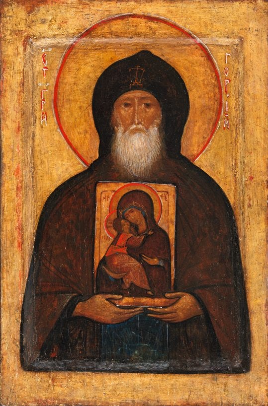
Image: St Gregory the Iconographer, painted by Gregory Kroug, 20th century

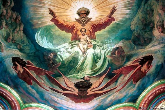
Unlike the West, which saw the development of Gothic and then Renaissance traditions from the 11th to the 16th centuries, the art of the Eastern Church did not undergo these transitions. However, the effects of the Enlightenment, which came after the Renaissance, were felt in the East, particularly in Russia, through the efforts of reforming rulers — Peter the Great and Catherine the Great especially — who looked to Western Europe as their model for modernization. Arising from this, there was an increased naturalism in iconography that, unlike the naturalism of Gothic art, was not grounded in a truly Christian understanding. The result was a style that is neither properly naturalistic nor properly iconographic.

Russian painters of the 19th century noted this degeneration, and arguments were made to abandon the iconographic style altogether in favor of Western naturalism in sacred art. For a while, Orthodox churches were adorned with 19th-century naturalistic styles. While this may have produced fine results in secular painting — the Russian traditions of portraiture and landscape in this period were indeed spectacular — they jarred with many Orthodox Christians, who felt that this naturalistic style of art undermined their worship. By the turn of the 20th century, commentators once again argued for the reestablishment of a purer, more authentic iconographic tradition. This process of creative retrieval, begun in that period, was interrupted by the Bolshevik Revolution, and it was not until the mid-20th century that the expatriates based in Paris who had escaped from Russia, including those already mentioned above, were able to work toward a change.

Image: 19th century Russian painting of God the Father and God the Son
Their approach was first to establish a canon of imagery they considered the epitome of the style (generally Russian icons from the 15th century). By analyzing the common features within this canon, they developed a theology to explain them, hoping to define a set of principles that would allow both conformity to the tradition and the legitimate organic development of styles within it, as needed by the Church in particular times and places.

It is a tribute to the work of this small group of pioneers that the painting of icons has developed so authentically that many people today wrongly assume that the iconographic tradition of the Eastern Churches has been passed down through an unbroken line since St Luke painted the first icon of the Theotokos. We are now in the third or fourth generation of icon painters who have passed these principles down from teacher to pupil since those 20th-century pioneers, and the best of them are creating work today that is as beautiful and significant as that of the great iconographers of the past.

Because of the success of the pioneering Russians based in Paris, iconographers from other Orthodox and Eastern Rite churches were influenced by their work. Among these were the Greek painter Photis Kontoglou, who contributed to the reestablishment of a flourishing Greek iconographic tradition, and the Egyptian Isaac Fanous, who did the same for the Coptic style.

I have long felt that their approach should serve as the template for Roman Catholic Christians to reestablish their Western traditions of Gothic and Baroque art today. My own analysis of those traditions is based on the work of those 20th-century Russian theologians and is my attempt to begin that process.
The Modern Myths of Iconography

The mystique that so many contemporary Roman Catholics and Protestant Christians associate with iconography has also emerged from this recent period, and bound up with this are several modern myths about icons. These include the ideas that you have to be Orthodox to paint icons well, that you have to be a monk to paint icons, that you must ritually fast and pray before painting an icon, and that the true iconographer does not paint icons but only ‘writes’ them.

Is it true that only Orthodox Christians can paint icons successfully? I would certainly agree that someone who regularly worships with sacred art is more likely to paint it well. This does place Roman Catholics at a disadvantage. Unless a Roman Rite Catholic prays the Divine Office with an image corner at home, he will almost certainly not have the opportunity to do so in the Roman liturgy as it is generally celebrated today, even if there is beautiful art in the church. This therefore greatly favors Orthodox and Eastern Rite Christians, although in principle it does not preclude others from painting icons well; in fact, there are several excellent Catholic iconographers today.

Can only monks paint icons? While a monk’s spiritual life is likely to be compatible with that of an artist who wishes to pursue his vocation, it is not the only form of Christian life that can offer such formation. A devout and sincere layman might flourish as an artist too, and there are many fine icon painters today who are not monks.

On the question of fasting and praying: while there is no accounting for whom God may choose to inspire, or which individual will respond well to that inspiration, the greatest chance of a good response lies with those who lead good and holy lives, and typically this involves regular fasting and prayer. However, this principle is not uniquely applicable to artists; it applies to every aspect of the Christian life and to every Christian. Icon painters should fast and pray regularly, as all Christians should, but this is not a special requirement peculiar to icon painters.

On whether we ‘write’ or paint icons: this question arises from the fact that the Greek and Slavonic words for creating an icon carry no distinction between the two activities, and could legitimately be translated as either writing or painting. One well-known Orthodox iconographer told me that he considered the insistence on the word ‘write’ to be ‘a bit precious.’ As far as he was concerned, if someone uses a paintbrush to apply paint, the English word for that activity is painting, and it does not diminish the standing of the profession to say so. On the contrary, when the icon is beautiful, and we venerate it as we should, that elevates the role of the painter of icons to one of the highest importance, regardless of what we call the process of creating them.

There is also an associated myth that overstates the role of a theology of method, as distinct from the theology that governs the style of the finished image. Some, for example, hold that the image must be created by starting with a dark base and adding layers of lighter color, because God created Light out of darkness. There is no basis for this. A painting is as good as it looks, and if the finished work is good, the method by which it was made is of secondary importance. This is confirmed by modern X-ray analysis of authentic and ancient icons, which shows that painters of the past used a wide variety of methods to produce authentic work.

A Short Summary of the Theology of Iconographic Style

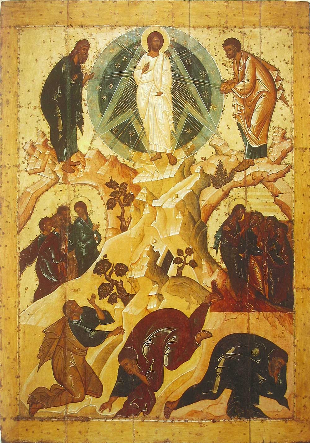
So what is the theology of icons? The iconographic style expresses a desire to present man in full union with God, that is, eschatological man. Consider the Transfiguration icon below, painted in Yaroslavl, Russia, in 1516.
The nimbus around Christ darkens toward its center, reflecting a theological point about the nature of divine light. Christ in the Transfiguration is understood as the prototype for all iconographic imagery, and the principle extends further, since all saints shine with the light of Christ because, as baptized Christians, they have ‘put on Christ’. The halo, typically a gold disc around the head, is a stylized representation of the light emanating from the person. In the Transfiguration icon, the prophets and Christ bear halos, while there is a convention that before Pentecost the apostles do not, though they are still portrayed as saints in other respects: there is no cast shadow from any figure, since each is his own source of light, and we see the floating sparkles of uncreated light on their clothes and bodies.

To convey the heavenly dimension, which is outside time and space, the image avoids creating the illusion of depth. The artist paints the image so that it lives, as it were, in the plane of the surface. Rarely does an iconographer use single-point perspective, in which things diminish with distance; he will often use inverted perspective instead, in which things appear wider as they recede.

The size of the beings and creatures portrayed varies according to the hierarchy of being, a feature often referred to as hierarchical perspective. Christ is the largest figure, while trees and mountains are shown smallest relative to their natural size. Even inanimate objects, such as trees and mountains, can be shown bowing toward Christ, indicating that each owes its existence to him and further reinforcing our sense that each has its place in the hierarchy of being. The negative space around the figures is usually a single color, often gold leaf, with minimal indication of the location. The gold or other single-color background reinforces the sense of flatness, and the environment is suffused with light, an effect accentuated by gold leaf that reflects candlelight, causing it to shimmer as though it were a source of light in itself. Some variants, particularly Western variants, have complex patterned backgrounds that achieve the same end — the sense of flat negative space around the figures.

The sense of another world is further heightened by placing the figures in the middle distance. No matter how near we approach the image, there is always some sense of distance between us and the closest figures depicted; they seem to recede as we draw closer. Even with our faces pressed against the surface, they remain some way from us. This creates a dynamic between us and the icon when we pray with them, for it instills in us a longing to be with the saint. This is a longing that finds its fulfillment only in heaven.

All icons aim to portray heavenly realities. Heaven is a realm in which time is compressed into a single moment; past, present, and future are perpetually in a single moment. It is difficult even to imagine this, but it is possible to reflect this mystery. A way to do so is to present a full narrative with different scenes from a story portrayed simultaneously in the image, even though, in real time, they happened sequentially. What took place over an extended period appears in a single image. This might be useful in an icon of the life of a saint, for example. It is common for an important event in the saint’s life to be the largest image, with several miniature scenes of other events from his life around the periphery.

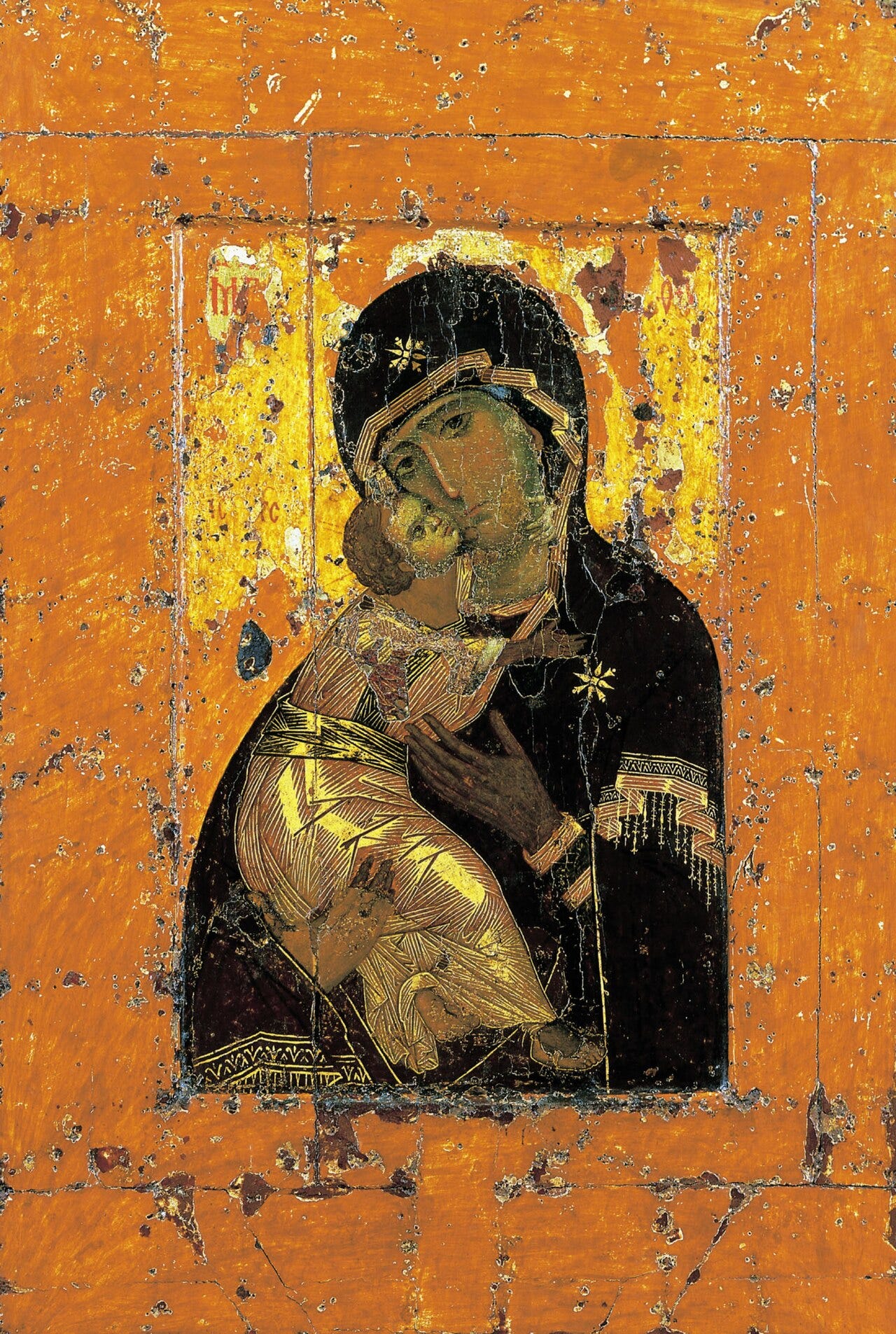
Consider now another image. This icon of the Mother of God with Christ is known as the Vladimir Mother of God. It was painted in Constantinople around 1100 AD, brought to Russia, and became the prototype and model for Russian iconography.
Image: The Vladimir Mother of God, Constantinople, c. 1100 AD. The prototype for Russian iconography.

The first thing to notice is how the Theotokos, who bore and gave birth to God, expresses a contentedness tinged with melancholy. This is called ‘bright sadness’ and is intended to convey that the saint lives in eternal bliss but nonetheless feels compassion for those who are not yet with God. The saints want us to join them, and they are happy to intercede for us so that it might happen.

The proportions of the person's features are subtly modified to communicate holy wisdom. The wise man reflects on God’s will before acting. To convey this aspect of wisdom, the receptive organs are relatively large, while the active ones are smaller. Therefore, the eyes are enlarged, and the nose, which inhales the fragrance of heaven, is elongated slightly, and the ears, if they are visible, are slightly larger than they would be naturally. (Typically, we don’t see Our Lady’s ears.) In contrast, the mouth and hands are made smaller. This is not to say that saints are inactive; when they act, their actions are effective. Rather, it speaks of an economy of effort in which nothing is wasted. And similarly, while there is no superfluous word coming from the mouth of a saint, every word that is spoken is golden.

We also see that Christ, though a child in his mother’s arms, appears as a little man. This indicates the paradox that, though human and physically immature, he is still fully God.

Another feature of icons is that the faces of saints are always portrayed in either a full or three-quarter view, so that both eyes are clearly visible. This symbolizes the idea that in heaven we can behold another and know them fully; nothing is hidden, and we are fully known to all others. Only the devil would be shown in full profile. (This is one feature that differentiates early Gothic art from iconographic art. Gothic artists, in order to portray a more naturalistic three-dimensional setting and the sense of a more lifelike interaction between the figures in the composition, gradually begin to place some of those key figures in profile.)

These stylistic devices in icons draw out realities that would otherwise be invisible. The modification of natural appearances, therefore, produces a greater realism than any naturalistic painting or photograph could achieve.

It is common for people who cannot draw well to want to learn to paint icons, assuming that draftsmanship matters less in this tradition, but this is not the case. The artist must not be tempted to use the style to conceal a lack of drawing ability. It takes great skill to reflect visible and otherwise invisible realities in the same painting, so that the two aspects support rather than undermine each other. Our figures must both sparkle with the uncreated light of Christ and read anatomically, just as the drapery must hang and fold as it would naturally around the figure.

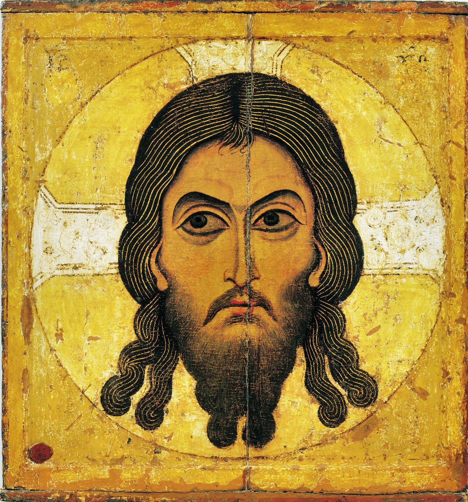
Here is another common image of Christ, known as the Mandylion.
Image: The Mandylion (Christ Acheiropoietos), 12th century, Russia.

The name comes from the archaic Greek term for ‘cloth’ or ‘towel’ and refers to the tradition that the prototype of this icon was a cloth pressed against the face of Our Lord, and that the image was miraculously transferred to it. It is perhaps the most famous of the icons called acheiropoietos, meaning ‘not made with human hands,’ images that are revealed rather than painted. Notice how stern Christ appears. This sternness is sometimes employed in the depiction of Christ to indicate that he is a judge. It must never be excessive, because we also wish to convey that he is a just judge and that divine justice is always tempered with great mercy.

In common with all authentically liturgical art, there is a general disposition against innovation and originality for their own sake. New icons are created only as needed by the Church, for example to portray a newly canonized saint. The icon painter always reproduces the prototype with an understanding of the ideal it is intended to express and always aims to portray the ideal as best he can rather than a simple copy of another work of art. Accordingly, the goal is to create something greater than that which he copies.

These revealed images — the ones said to be “not made with human hands” — raise a question that goes to the heart of the whole tradition: does what we see in an icon actually correspond to what Christ and the saints are like in heaven, or is it simply an internally consistent system of symbols? That question, and the most remarkable of these revealed images, Our Lady of Guadalupe, are the subject of the second of these two articles.

More recent articles:

For more articles, see the NLM archives: