Wednesday, October 30, 2019

Back In Print At Last: Enid Chadwick’s My Book of the Church’s Year

As a regular NLM reader likes to say: “The hits keep on comin’!” Even in these dark times of ours, we hear news on an almost daily basis of new (positive) pastoral initiatives, new locations of the old Mass, new sacred music commissions, new religious communities and apostolates, and especially new traditional Catholic books of the highest quality. What was once a trickle has become a river.

Some years ago, I attempted to reprint a gem of a book, Enid Chadwick’s My Book of the Church’s Year. My cheap and flimsy paperback was by no means adequate to the task, and I let the project fall by the wayside. Happily, Lisa Bergman of St Augustine Academy Press, well known for their book Treasure and Tradition (available now in English, Spanish, and Portuguese), has just released a beautiful hardcover edition of Chadwick done so well that the endpapers, thickly-textured paper, and rich color illustrations of the original edition are all faithfully reproduced. The photos will show this better than any words.

Lisa asked me to contribute a Foreword, which I was glad to do, as this is one of my all-time favorite children’s books. Here’s part of what I wrote:
It’s the loveliest, most charming, and in many ways most clever introduction to the liturgical calendar I’ve ever come across. It is informed by a deep Catholic love for the seasons of the year, the feasting and fasting, the great holy days, the pageantry of the saints and their stories, the underlying rhythm that connects nature, culture, and sanctity. . . . Though written and illustrated by a High Church Anglican, the feasts depicted in this book differ only in very minor ways from the traditional Catholic calendar. Chadwick’s handsome illustrations are simple enough for young children, and yet at the same time full of complexities for those who are attentive.
My Foreword includes pointers on the theological insights built into the illustrations, comments on terms and calendar features, and notes on particular saints who may be less known to readers. As Fr Hunwicke recently pointed out, it can be striking to see how closely traditional Anglican publications like Chadwick’s correspond to the ethos and even the details of traditional Roman Catholicism than either of them do to anything from the sphere of the Novus Ordo. Examples would include an emphasis on Christ coming in judgment; Epiphanytide; January 1st as the Circumcision; February 2nd as the Purification or Candlemas; February 14th as St. Valentine; Septuagesimatide, with mention of Lenten fasting; Passiontide; Low Sunday; May 3rd as the Finding of the Holy Cross; Rogationtide; the lifting of the chasuble at the elevation and kneeling for communion (p. 33); a catafalque on All Souls, being incensed by a priest in a black cope; and so forth. Such things are simply not to be found in children’s books published after 1969.

Helpfully, Lisa has provided at the book link an electronic flip-through of the contents (scroll to the bottom of the page to find it) for anyone who would like to preview the content before purchasing. If you are looking for an ideal Advent or Christmas gift, a read-aloud to catechize about the liturgical year, or a special weapon for the arsenal of books for little ones to look at in church, you’ll want to check this out!

Some comparison photos, showing the original 1948 edition and the 2018 facsimile edition (selling at the website for $12.95).

Thursday, January 25, 2018

Making Books in the Middle Ages

Here is an interesting discovery from the Youtube channel of the Getty Museum, which explains the whole process of making a book in the Middle Ages, from the creation of the parchment, to the ink, the illuminations, the binding and the cover. This really makes us appreciate the considerable time and effort that scribes and craftsman had to devote to the production of a just a single tome. The item shown at the beginning, and seen again towards the end with a high-relief metal cover, is a sacramentary from the Getty collection, made at the famous abbey of Fulda in Germany, in the second quarter of the 11th century. (MS Ludwig V2)

Monday, December 11, 2017

Hand-drawn Altar Cards by Daniel Mitsui

Daniel Mitsui is an artist quite well known to readers of NLM for his exquisite work in calligraphy and iconography. He was recently commissioned to produce a set of altar cards and went at it with his customary thoroughness, ingenuity, love of detail, and delight in the Gothic aesthetic. I received a set of these cards to examine, and I must say that they are simply stunning. The overall design is harmonious and pleasing to the eye; the font comes across as strong, slightly ornate, and yet highly legible; the illuminated initials add considerable interest; and the iconographic program followed in the ample margins is a microcosm of the entire liturgical year and indeed the history of salvation. As a teacher, I found myself thinking, “I could teach a catechism course just using these altar cards.” More to the point, they embody the entire Catholic theology of the sacred liturgy.

Here are some photos; afterwards I shall quote the artist’s explanation of the iconographic program.

The central altar card (16" x 20"), with my hand for the sake of scale:

(A straight-up JPG of this card may be accessed here.)

The Gospel card and Lavabo card (each 9" × 12").


(Again, JPGs of the above two cards may be found here and here.)

The Lavabo card with my hand, for scale:

Some details of the central card:


Two details from the Gospel card:


The artist’s website offers a full explanation of the choice and arrangement of scenes, which evince a deep grasp of liturgical symbolism and patristic commentary.
The Gospel side card contains the beginning of the Gospel of St. John (In principio erat Verbum), and the pictures on it reflect the themes of Creation and Incarnation. Running down the left border and across the bottom, a series of eight small scenes illustrate the six days of Creation, with the Creation of Adam and the Creation of Eve depicted individually. Following the older iconographic tradition, and the words of the Gospel itself (Omnia per ipsum facta sunt: et sine ipse factum est nihil, quod factum est), the Creator depicted in these miniatures is God the Son. The preaching of John the Baptist appears in the historiated initial.
          In the bottom corners I drew the Annunciation and the Nativity of Jesus Christ, which begin a sequence of events in the life of Christ that runs across the bottoms of all three cards.
          It continues on the Epistle side card, with the Adoration of the Magi and the Baptism of Christ. The historiated initial and the eight small scenes depict nine of the prophecies read at the ancient ceremonies of the Easter Vigil: the Deluge and Noah’s Ark, Pharaoh’s army drowned in the Red Sea, a prophecy of Isaiah, a prophecy of Baruch, Ezekiel’s vision of the valley of dry bones, another prophecy of Isaiah, the repentance of Nineveh, the Canticle of Moses and Shadrach, Mesach and Abednego in the furnace. These prophecies are associated with Baptism, and thus fitting to the psalm on the card (Lavabo inter innocentes).
          On the central card, in each of the four corners is the scene of an Old Testament prefigurement of the Eucharistic sacrifice: the Sacrifice of Abel, Abraham’s sacrifice of Isaac, the Sacrifice of the Paschal Lamb and the Sacrifice of Melchizedek. Three of these are mentioned in the Canon of the Mass; two of them, together with the Creation depicted on the Gospel cards and the nine prophecies depicted on the Epistle card, complete the twelve prophecies of the Easter Vigil.
          Running along the bas-de-page are six scenes from the life of Christ: the Temptation in the desert, the Transfiguration, the Last Supper, His washing St. Peter’s feet, the Resurrection and the Ascension. The historiated initials that begin the Gloria and Credo contain, respectively, pictures of the Annunciation to the Shepherds and the Descent of the Holy Ghost at Pentecost. I drew a large picture of the Crucifixion at the top of the central column of text.
          The arrangement of scenes summarizes the liturgical year: the Gospel card represents Advent, as the Preaching of John the Baptist is the subject of the Gospel reading for the 3rd and 4th Sundays, and the Annunciation Gospel is read on the Ember Wednesday. Advent of course concludes with the Nativity, which begins the Christmas season.
          Continuing in chronological order to the Epistle side card, the Adoration of the Magi and the Baptism of Christ represent Epiphany; both are manifestations of Jesus Christ’s divinity. The two scenes below the left column on the central card have a longstanding iconographic association, being recounted in the Gospel readings for the first two Sundays of Lent. In the central column of the central card, the Last Supper, the washing of feet, an the large Crucifixion together represent the Holy Triduum, the center of the liturgical year. The images in the next column (Resurrection, Ascension and Pentecost) represent the Easter and Pentecost seasons.
          On the left and right borders of the central card I drew standing figures of six saints. On the left are the first three mentioned in the Confiteor: the Blessed Virgin Mary, Michael the Archangel and John the Baptist. On the right are three more mentioned in the Libera nos: the Apostles Peter, Paul and Andrew. 
You have to see these cards to believe them. I am looking forward to framing this set for local liturgical use. I would certainly recommend these altar cards to priests, deacons, and any laity who are looking for a special Christmas gift for your TLM-celebrating clergy.

The commissioned set was drawn in ink on calfskin vellum with gold and palladium leaf details, and hand lettering. What I have photographed here is an open-edition giclée print on Lexjet archival matte paper, with a custom typeface, Benedict, utilized instead of handwritten letters, to improve readability.

The cards may be ordered directly from the artist.

Monday, October 30, 2017

“What Were They Smoking?”: On Liturgical Art from the 1970s

My liturgical library contains two types of books: ones that I look at because they are beautiful, edifying, or full of wisdom and piety; and ones that I keep precisely because they are the opposite. As I once said to a friend, “You need to know what people were thinking when they destroyed the liturgy. We can make all the guesses we want, but if we don’t actually read the authors of the fifties, sixties, and seventies, we won’t be able to get into their mindset and see what makes them tick.” In this latter category of my library would be such recently added gems as the collection of essays Secular Priest in the New Church (Herder and Herder, 1967), George McCauley’s Sacraments for Secular Man (Dimension Books, 1969), and Leonardo Boff’s Sacraments of Life, Life of the Sacraments (a translation of a 1975 book). Boff’s book is notable for the coffee cup, hunk of bread, and burnt-out cigarette on the cover, which allude to the chapter “My Father’s Cigarette Butt as Sacrament.”

Among these peculiar treasures is a smallish fake-leather-covered red book called The Sunday Missal, first published in 1975 by Collins in London. Here it is, in all its faded glory:
The book opens with a hauntingly melancholy Preface by the long-suffering John Cardinal Heenan, Archbishop of Westminster, well known to traditionalists for his correspondence with Evelyn Waugh, in which he repeatedly stated that the liturgical reforms were just about over -- right when they were going to get worse and worse. Heenan’s Preface is pathetic, as he palpably longs for a better past and half-hopes that this missal will half-match up to it:

The Introduction, while not heretical (unlike the original version of the General Instruction that was hastily rewritten after the Ottaviani Intervention), nevertheless displays the same sort of “theology lite” that was and still is characteristic of the post-conciliar period. Characteristically, “eucharist” is not capitalized. Jesus gives himself “under the eucharistic signs of bread and wine to be the life and food of the community.” (This could be straight from Boff, incidentally.) “When the priest greets the people with the words ‘The Lord be with you,’ he is stating a fact -- the Lord is with his people as they gather to celebrate the eucharist.” Curious how a blessing in the subjunctive has turned into a declarative statement. The second paragraph is actually pretty Tridentine. The third paragraph apologises for the length and number of the readings. In the fourth paragraph we see the conciliar tricolor waved from the barricades as the old city smoulders below: “The more the people enter into the mystery of the eucharist by conscious, active, and fruitful participation, the more they grow in holiness.”


The real wonders begin when we start to see the block prints that are, it is to be believed, meant to depict in graphic form the wonderful liberating energy, the controlled chaos as of split rocks, and the implicit but nearly emergent parousia brought to the People of God by the renewed rites.

Since the art speaks for itself, no more words are necessary. Enjoy!


Thursday, October 27, 2016

Newly Republished: The Little Flowers of Saint Francis with Antique Illustrations

Years ago in Austria, I found a small rare book, called on its cover Franz von Assisi, and on its title page Legenden vom Heiligen Franz. The pocket-sized book, only 106 pages, contains selections from The Little Flowers of Saint Francis, translated by Karl Toth and illustrated by Maximilian Liebenwein. It appeared as part of the Kleine Amalthea-Bücherei from the Amalthea Verlag, Zürich-Wien-Leipzig, in 1921.

The illustrations are vigorous, clear, and dramatic, with the strong graphic design of their time period. Of particular note are the eight full-color plates, which were printed with gold, blue, and red, and then colored in with pencils.
From the 1921 edition in German
That was more than 15 years ago. Every once in a while, I would take the book down from my shelf and wonder anew at its artistry. After deciding that a simple facsimile, though doubtless intriguing to a German speaker, would do little for those of Anglophonic readership, my son and I set to work scanning the images and compiling the stories from an elegant English translation of The Little Flowers in the public domain, so that we could bring out a new edition and share this wonderful artwork with others.

We began with the stories that were already in the German volume, but as we went along, the charm of other stories worked on us irresistibly, and so we added them, too — hence the larger size of our volume. It is not the complete Little Flowers, but it delivers a respectable portion of classic stories about St. Francis and his early companions. These stories bring us face-to-face and heart-to-heart with the real St. Francis and with his genuine followers: radical Catholics; ascetics, holy fools, and mystics of the Mass; enthralling in their colorfulness, yet a challenge to our modern assumptions and an antidote to our contemporary poisons. There is much in these pages that Catholics have forgotten and need to recover. But I digress . . .

The book is available in two versions — a hardcover from Lulu (on the left in the photo below) and a paperback from CreateSpace (on the right; also available at Amazon). Both of these are 6" x 9", that is, much larger than the original volume.


Although the cover designs are different, the interior content is identical: 114 pages, with eight full-page color illustrations and 19 black and white drawings. Decorative red capitals are liberally spread throughout the book. (Note that the previews at Lulu and Amazon do not include any of the full-color pages — a good reason to share some more photos here.) The size of the print and the fine illustrations make it an ideal book for older children or for reading aloud. This is something I tested with my own family; the book was a great success.


Monday, October 24, 2016

Missals from Silverstream Priory (3): Augustinian Missal of 1716

One of the oldest missals, if not the oldest, that the Benedictine Monks of Perpetual Adoration at Silverstream Priory have in their possession is this lavish volume from 1716, the title page of which clearly proclaims that it is a Roman Missal with all the feasts proper to the order of Augustinian hermits.


As is typical with books of this period, the artwork is monochromatic, while the text features red rubrics (that’s a redundancy of course!) and red capitals. The book is in excellent shape given that it is exactly 300 years old.


Monday, October 17, 2016

Missals from Silverstream Priory (2): Regensburg

For an explanation of this series, see this article from last week.

Today, we will look at a German altar missal.

Unfortunately, I did not record the date of this particular missal printed in Regensburg by the famous publisher Friedrich Pustet, but judging from the artistic style and the use of color printing, it is likely from the 1920s or 30s. (It certainly must predate the dogmatic definition of the Assumption, for reasons that will become clear later.)

This missal takes the prize for the largest number of thematic drawings I have ever seen in any altar missal. An incredible attention to detail governs every page, with capitals illuminated in reference to the particular day of the liturgical calendar rather than generically styled.

There is a luxuriant creativity at work here, perhaps at times distracting and whimsical, but full of vitality and boldness, that bespeaks a laudable desire to produce a new work of art rather than merely regurgitate past conventions. I cannot show all of the artwork (I took about 150 photos of this missal!), but the selection below will give a good sense of this missal’s uniqueness.

I wonder: Could we ever commission another such missal, where every saint had his or her proper emblem, where each solemnity was graced with an illumination? Perhaps one day, in better times, it will happen again -- once we are no longer fighting about such arcane questions as whether sacramental marriage is between one man and one woman for life, or whether it is permissible to murder unborn humans (or to elect officials who think it is). We need a little Pax Romana first. But I digress...


Monday, July 25, 2016

Award for the Most Hideous Lectionary Ever

In an article entitled "Books That Cry Out the Unique Richness and Holiness of God's Word," I argued that somewhere along the line, we decided to forego the expense and trouble of creating beautiful artifacts for the sacred liturgy, and settled for a combination of aesthetic mediocrity and repellent modern ugliness. Sometimes it seems as if intentions are good but artistic ability is totally lacking; other times it seems that the intentions are actually modernist and the goal is to repudiate past tradition in favor of a newly-fashioned religion of the future. Whatever the case may be, in my article I provided photos of exquisite historic lectionaries and modern imitations in a similar vein, as well as of some unremarkable contemporary lectionaries.

Recently, I came across a set of lectionaries that struck me as the most hideous I'd ever seen. Since there may come a day when our children and grandchildren do not believe us when we regale them with stories of such things -- they will protest that we are surely exaggerating like a bunch of tippling fishermen -- I thought it worthwhile to reproduce some images here, followed by the palate cleansing contrast of several books in my library that enshrine the Word of God and the rite of the liturgy in a beauty that befits them.

First, the books published in 1999:


Wednesday, May 11, 2016

A New Artwork Based on the Medieval “Creeping to the Cross”

Those intrigued by liturgical practices of late medieval England, as well as those who are interested in contemporary illustration and calligraphy, should make a point of checking out this new work by Daniel Mitsui.

The drawing depicts the “Creeping to the Cross” that occurred not on Good Friday, but on Easter morning, after the Crucifix is disinterred from the Easter Sepulcher, as described in Eamon Duffy’s book The Stripping of the Altars, and alluded to in The Vision of Piers Plowman.

I encourage you to go and have a look at the literary and liturgical description at Daniel’s website. The details in this drawing are absolutely fascinating, particularly the intertwined monsters in the background, which seem to draw upon Bosch and Escher, and the Amen-Alleluia pattern behind the figures.

Go here for the full description and image.

Monday, February 01, 2016

Books That Cry Out the Unique Richness and Holiness of God’s Word

A Romanesque Gospel book
Why are we afraid to buy, commission, make, or build beautiful things for our churches?

Why are we content with plainness and mediocrity?

Why do we have no aspirations to do the greatest possible honor to our God, to His Word, to His Sacraments, to His house, and therefore to His people who will worship there?

Why do we produce so few masterpieces of fine art today?

Here are some absolutely stunning Epistolarium and Evangelarium covers from various periods, Romanesque, medieval, Baroque, and modern (19th century), that embody the Catholic spirit of proclaiming unmistakably the utter uniqueness of Sacred Scripture.
A Gothic Gospel book

The Word of God is given a rich casing of gold and semi-precious stones or glass to indicate the priceless treasure of wisdom contained within. It is decorated with figures of the saints, often stories from the life of Christ or the Virgin, to proclaim outwardly, even prior to the use of any words, the burden of its inner message of holiness. In the very excess of these book covers there is a potent symbol of the ineffable, of what cannot be depicted, that mysterium of which no human art can ever be worthy.

When we make something appreciably less magnificent than such works of art, and yet we might have done something better (in other words, we are not suffering for lack of money or workshops of skilled laborers), what then are we actually saying about the content of the book and our beliefs in regard to that content? About its superabundant excess of wisdom, its supreme worthiness of our affection and awe? About its value in our community and within our hierarchy of economics and politics?

A Baroque Gospel book
The way in which the fine arts embody and communicate the communal value of any given object, practice, or content is far too little noticed among Catholics. Magnificent Gospel books preach the truth of the Gospel by their very splendor, their exaltation above any other book, the time, money, and care that went into them. They radiate the preciousness of the Law of God, more valuable than fire-tried gold, more costly than any jewels. Conversely, plain or ugly Gospel books say something about a community's lack of faith in a deconstructed, demoted Gospel. Ugly altars or ambos or chairs or vessels all transmit the same subliminal, prerational, and unarguable message: this is a playground for second-rate stuff, the left-overs, the unwanted, a half-serious pretense that no person of moderate taste would allow in their own living rooms.

Monday, November 30, 2015

Recent Typeface Design and Calligraphy from Daniel Mitsui

We have much work to do in the rebuilding of Catholic culture, and in this “slow evangelization” (as Stratford Caldecott called it), liturgy can be compared to the right hand, the fine arts to the left hand. I found myself thinking about this when looking at some magnificent calligraphic work by well-known Catholic artist Daniel Mitsui, and reading his superb lecture at the Franciscan University of Steubenville, “Invention and Exaltation.” (The text may be read here; a video of the lecture is available here. Highly recommended.) Daniel visited the university to open an exhibit of his artwork in the Gentile Gallery on September 14th.

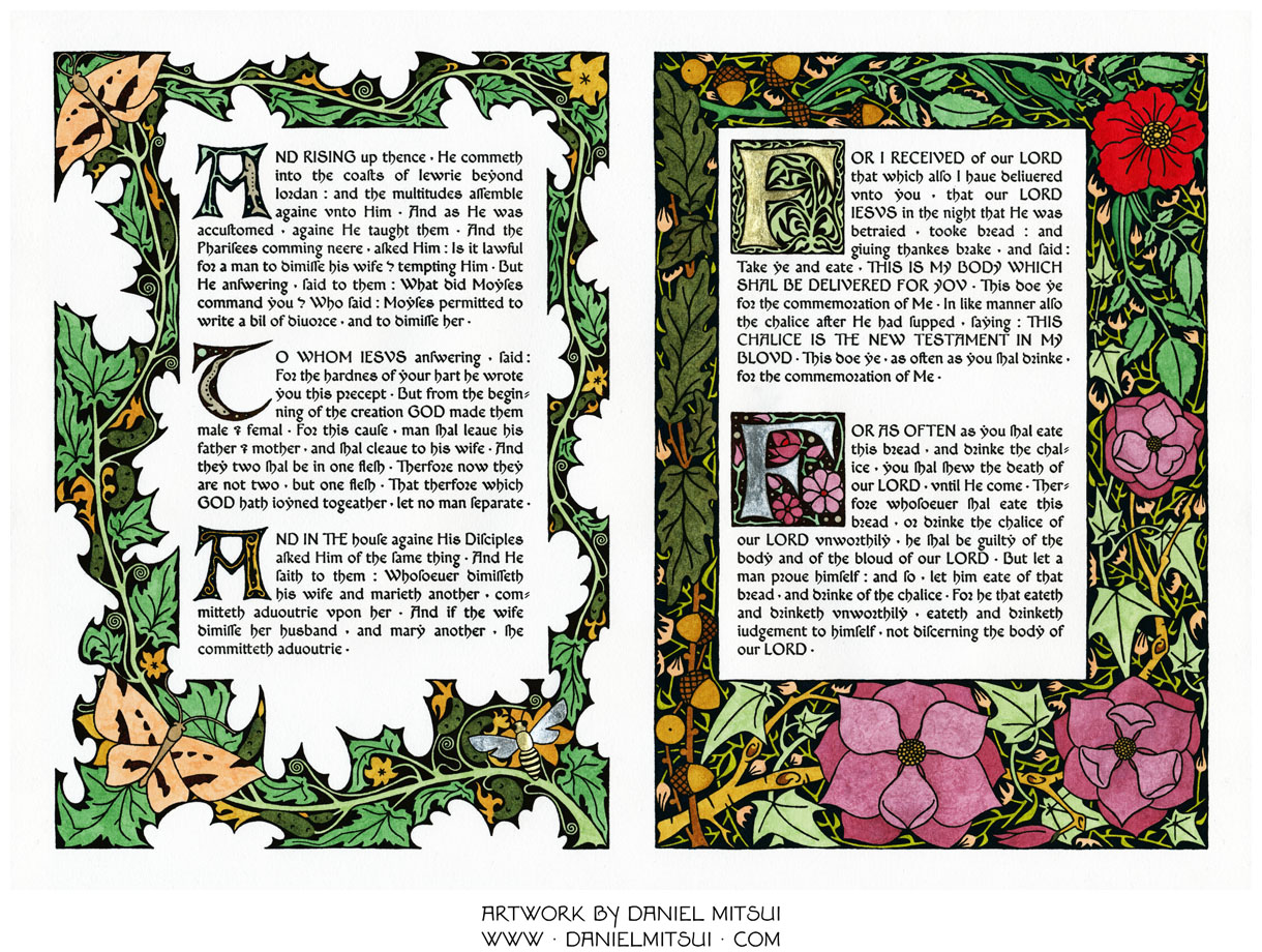
Following up on my earlier post about the layouts and typography of Dom Benedict Andersen, I wanted to share with NLM readers some of Daniel Mitsui’s recent experiments with designing his own typefaces, a painstaking art form he is pursuing in order to work towards the publication of new illustrated fine press editions of late medieval books. Two of the pieces now on display in Steubenville are typographic broadsides, one of them prepared in anticipation of the Synod on the Family:

(To see these at the artist's website, go here and here.)

In toto, Daniel has designed four typefaces: Benedict, Victor, Adam, and Michaëla. The marriage and family texts above are written in Benedict; the Lord's Prayer in Victor. Here are samples of Adam and Michaëla:


Some time ago Daniel did this "Ecce quam bonum," which is a masterly example of the art of illuminating a text (we see again the Benedict font):

These are truly exquisite pieces of work, and we are all looking forward to many more from this extraordinary artist. Check out his website for a complete portfolio and items for sale.


More recent articles:

For more articles, see the NLM archives: