

The De defectibus Missae, which was issued by Pope St. Pius V and is included in every Tridentine altar Missal, lists not only defects that render a Mass invalid (such as the wrong matter, form, or intention) but defects that render a Mass less than ideal, such as celebrating Mass: in an unconsecrated place; without at least one altar server; without a gold or silver chalice; or without a “Missal present, even though the priest may know by heart the Mass he intends to say.” (X.31)
Indirectly, the latter proscription indicates that, in the mind of the Church, the Missal is not an oversized cheat sheet or a primitive teleprompter that helps the celebrant “remember his lines” but a part of the performance itself, so to speak. Rubrics govern its placement and movement within the action of the liturgy; and what is more, when the priest must bow his head at the mention of a holy name, he sometimes does so in the direction of the Missal as the nearest symbol of Christ. He even shows a similar reverence to this object as he does the altar. In the 1962 Missal, “at the end of the Gospel, the priest lifts the Missal with both hands, and bows to kiss it where he signed the cross, saying the Per evangélica dicta.” An almost identical rubric exists in the 1970 Missal: “He then venerates the book with a kiss, saying privately, Per evangelica dicta.” (GIRM, no. 175)

The beginning of the Roman Canon in the Gellone Sacramentary, ca. 780 AD (Folio 143v; Bibliothèque National de France; Département des Manuscrits, Latin 12048)
The Roman Missal--that is, the physical book itself--can therefore be studied as a sacred artifact. And one of the most distinctive features of this sacred artifact (besides, in my opinion, the margin tabs that help a priest turn pages without the use of his canonical digits) is the transformation of the first letter of the Roman Canon into a work of art. As we will see in an upcoming article, the Te in Te igitur is an address to the Father, but that did not stop the pious imagination from seeing that the first letter of the word resembles the cross of the Son and from depicting it as such. The earliest witness to this artistic tradition is from the Gellone Sacramentary, ca 780 A.D., but by the tenth century it was common and by the twelfth it had earned its own separate page. This separate page, which came to be known as the canon page, usually contained the finest illumination in the entire Missal and was often the object of the priest’s osculatory affection. We can tell from the wear-and-tear of several medieval manuscripts that some priests treated the Missal at the beginning of the Canon the same way they did at the end of the Gospel: moisture damage from thumbs and lips indicates that they lifted the book up and kissed the image of Christ’s crucified feet on the canon page.[1]

Opening of a missal at the Canon, Use of Utrecht, ca. 1400–1410 with added sections, Northern Netherlands. The Hague, Koninklijke Bibliotheek, Ms. 128 D 29, fols 128v-129r.
As for the rest of the text of the Canon, since the “T” had now taken on a life of its own and moved to another page, a new initial “T” was generated to replace it,[2] much like the eyes of St. Lucy or the breasts of St. Agatha. This new “T” was in a larger font than the rest of the text: to this day in typography, a “Canon” is “the largest size of type that has a name of its own.”[3]
In addition to its similarity in shape to the cross on Calvary, a “T” or “t” in the Roman alphabet resembles a Tau, the last letter of the Hebrew alphabet. Tau plays an important role in the Book of Ezekiel:
And the Lord said to him: “Go through the midst of the city, through the midst of Jerusalem: and mark Tau [in blood] upon the foreheads of the men that sigh, and mourn for all the abominations that are committed in the midst thereof….Utterly destroy old and young, maidens, children and women, but upon whomsoever you shall see Tau, kill him not, and begin ye at My sanctuary.” (Ezek. 9. 4, 6)
It is not difficult to see how Church Fathers like Jerome saw this chilling passage as a Passover-like type prefiguring the Elect whose foreheads are signed in the Book of Revelation. (see Rev. 7,3) In a homily at the Fourth Lateran Council in 1215, Pope Innocent III challenged all Catholics to make the Tau their own Passover, ending his exhortation with the stirring words: “Be champions of the Tau!”
One Catholic who took that challenge to heart was St. Francis of Assisi, who often signed his letters with a Tau. Today, it is a part of the Franciscan Coat of Arms.

The Franciscan Coat or Arms consists of a Tau with two crossed arms. The one with nail wounds represents Christ and the other St. Francis of Assisi, who bore the Stigmata.
One may therefore ruminate on the “T” that invokes the Father in the Te igitur as an emblem of the Tau that is the sign of His crucified Son, He who is also the last letter of the Greek alphabet, the Omega. (see Rev. 22,13)[4]
Official translations, of course, make this tradition difficult to maintain, not to mention the Novus Ordo’s plurality of Eucharistic Prayers (none of the new ones in Latin begin with the letter “T” except Eucharistic Prayer “On Reconciliation” II, which is as rare as hen's teeth).[5] ICEL’s original translation of Eucharistic Prayer I begins with us rather than God and with a “W” rather than a “T”: “We come to you, Father, with praise and thanksgiving…”[6] The 2011 ICEL translation is a marked improvement in both regards: “To you, therefore, most merciful Father, we make humble petition and prayer…”—even if the “T” is now only indirectly theocentric.[7] The problem could be solved with archaic English, such as “Thee, o most clement Father, do we humbly beseech and implore…” provided one does not mind the somewhat awkward syntax and the use of “thou.” Or, one can keep the artistic convention (as some well-made new Missals do) despite the disconnect between the image and the letter that follows it.
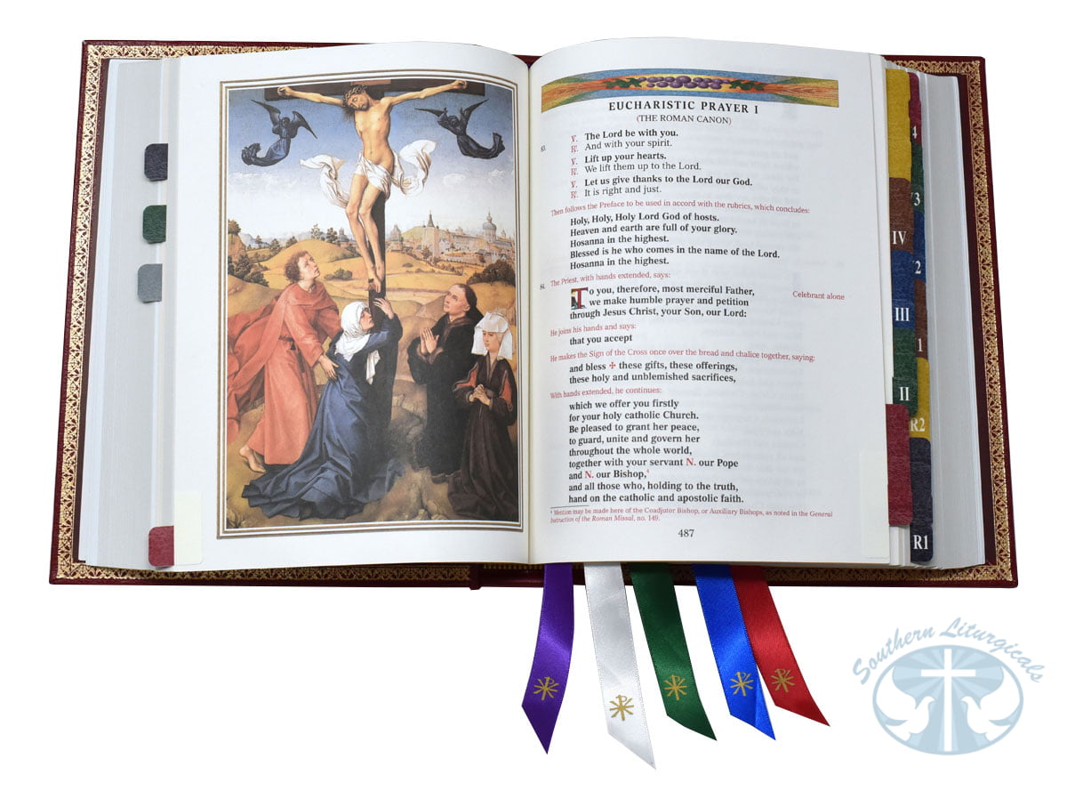
The Roman Missal: Deluxe Edition, 3rd ed. (Catholic Book Publishing, 2011)
Notes
[1] See Kissing: From Relics to Manuscripts.
[2] Josef Jungmann, S.J., The Mass of the Roman Rite: Its Origins and Development, vol. 2 (Benzinger Brothers, 1951), pp. 105-106. The development of this convention affected the world of printing
[3] American Dictionary of Printing and Bookmaking (New York: H. Lockwood, 1894), p. 79. The size varies according to nationality and system. In the United Kingdom, for example, a Canon is font size 48, while the same size in French is a Gros-Canon and in Germany a Kleine Missal.
[4] “Even the first letter of the Canon, in the Te igitur, recalls the mystical tau, which in the Old Testament was written with sacrificial blood upon the foreheads of those whom God wished to be preserved.” Michael Fiedrowicz, The Traditional Mass, trans. Rose Pfeifer (Angelico Press, 2020), 272.
[5] 2002 Missale Romanum, p. 681.
[6] 1985 Roman Missal, p. 542.
[7] 2011 Roman Missal, p. 635.