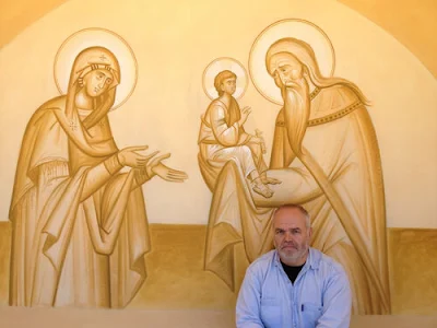
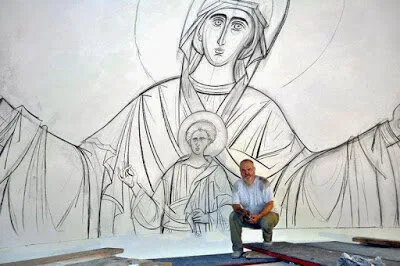
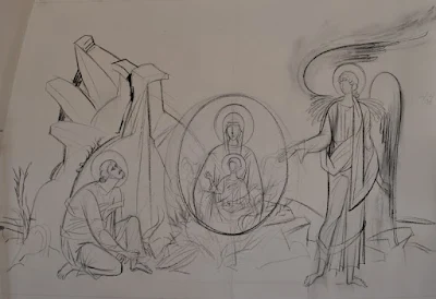
Kordis is renowned for his style of draughtsmanship, which incorporates rhythmical, sweeping lines that embed a dynamic and harmonious proportion into his compositions.
Iconography primarily uses line to describe form. This is distinct from Baroque art, for example, which uses tonal contrast to describe form. In order to draw with the line, we must understand what a line is representing in a drawing, which is the perceivable edge of an object. This might seem to be a statement of the obvious, but it is not, because there are no lines in nature, only contrasting edges.
We are able to perceive an object because it stands out from the background that surrounds it. The contrast between the background and the object will be either a contrast of color or contrast of tone. If there is no contrast, then the edge is invisible to us. (This fact is used to make a soldier wearing camouflage disappear in the dappled light of the woods, for example).
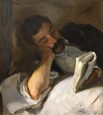
Artists represent this contrast either by drawing a line to represent the contrasting edges, or by painting the conjunction of an area of dark tone and an area of light tone. Leonardo da Vinci always used the method of adjacent areas of different tones, and set the standard for naturalistic art up until the beginning of the 20th century. For example, in this painting by John Singer Sargent, there are barely any lines at all. What we perceive as a line is typically the conjunction of two contrasting areas. This is actually closer to what we see in nature. A line, therefore, is a partial abstraction of what is seen. It is interesting that children will instinctively draw with lines and not tone. Typically we have to be taught to draw and paint as we actually see things.
When the artist uses line to describe form, he will use some tonal and color variation as well, but these are always supporting players in describing form - the work has been done by the line, so to speak - and so the use of color and tone becomes more decorative and symbolic of form than descriptive. The artist therefore has much more freedom in this second phase if he understands what he is doing.
If we look at Kordis’ line drawings, they are distinctive by virtue of the wonderful grace and flow in the use of line, certainly, but nevertheless are still conventional iconographic drawings.
When Kordis adds color, however, he is much less conventional and loose in its application. This gives his icons a modern feel, but because his draughtsmanship is so precise, he stays within the bounds of the iconographic tradition. When I look at them, he achieves an effect by which the figures are not only radiating uncreated light, they are so saturated with light, it seems, that the light almost seems to be dripping off them. This is an effect I would want to master! If this were me, I might change the color palette slightly (just my personal taste, you may differ from me on this front), but I would love to have the opportunity to study with this master iconographer so that I could learn his techniques and observe how he uses this freedom in the use of color. I would then probably adapt this to my own particular taste.
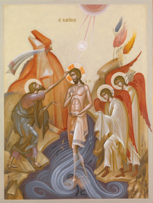 |
| Theophany - the Baptism of the Lord |
 |
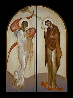
| Ss. Andronikos and Athanasia |
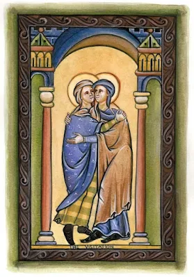
 |
| The Annunciation |
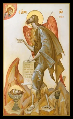 |
| St John the Baptist, the Forerunner. |
Exercising greater freedom in the use of color, while maintaining a disciplined approach to the use of line might be, it occurs to me, a way that students of his could develop sacred art styles for themselves that are authentic yet connect with modern man. This is precisely why, incidentally, I have pushed the study of the Western style of the 13th-century English School of St Albans and other similar illuminations from the period, such as the recently featured German illuminations in the
Hortus Deliciarum, as forms that might appeal to those worshipping in the Roman Rite today. These are also strongly line-based and so, similarly, allow for greater freedom of expression in the application of color so as to appeal to contemporary taste.
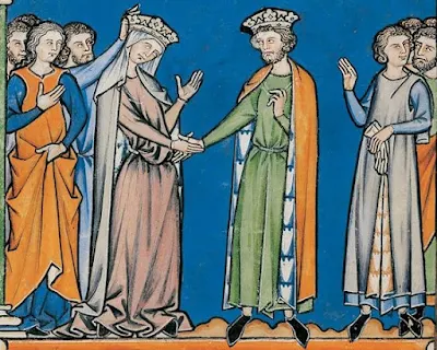 |
| 13th-century Parisian illumination |
 |
| 21st-century illumination (by yours truly) based on art from the 13th century |